

I love bad UX
Make it difficult for me, please

I remember a time when neon letters and illegible hyperlinks were commonplace. People unironically used the Papyrus font. Every site looked a little like Craigslist.
Bad user experience brings me back to a simpler time. It humanizes the people behind these digital experiences. They, too, didn’t consider how annoying it’d be to hear the same Backstreet Boys song auto-play as you scroll through a site.
There was no such thing as simplicity on the early internet. You were assaulted by a plethora of buttons, each more cryptic than the next. Navigation alone was enough to get you offline.
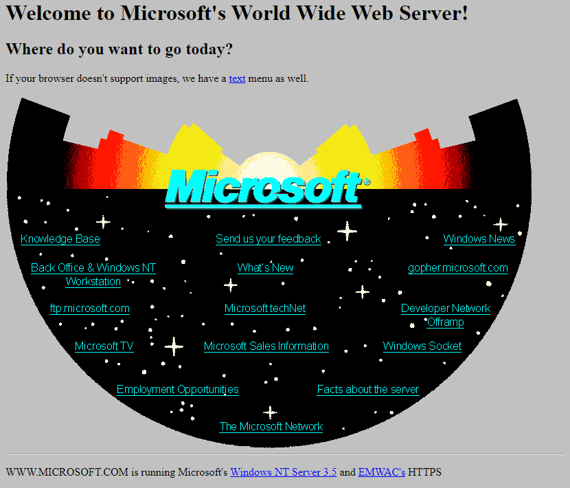
UX first emerged from a series of detrimental miscommunications. We built tech that we couldn’t intuitively use and as a result, caused a partial nuclear meltdown (Three Mile Island accident of 1979), a series of WWII plane crashes, and so much more. One of the first ads that Apple —pioneer of the term “User Experience” (Don Norman coined the phrase, but the company made it a brand) — ever printed read: “Since computers are so smart, wouldn’t it make sense to teach computers about people, instead of teaching people about computers?” That was 1984, when good UX helped users communicate with their hardware.
Today, digital experiences are sexy. Every component is animated. Images are full bleed. All it takes is one tap for your shopping to show up in 2-biz days.
UX, now an 11.57 billion dollar market, has become a practice of optimization. The emergence of “Happy” or “Golden” Paths presumes a singular, optimal sequence of interaction. But is it optimal for you or optimal for the company?
Spotify’s massive shuffle button makes it easy for you to use their platform. The company reduces the entire listening experience into a singular tap so that, out of convenience, you opt into allowing them to shove Sabrina Carpenter songs down your throat whilst getting their streaming numbers up. Amazon makes it commonplace to accidentally order something (before pushing the cost of returns onto small business owners). TikTok keeps you in prime rot by only requiring a swipe up.
Good UX now is as much about making it impossible for you to find the “Unsubscribe” button as it is getting you to engage in a profitable way. I don’t imagine this is what Adam Smith meant when he described the Invisible Hand.
What if… I don’t like being told what to do?


Soren Iverson’s satirical iterations of everyday user interfaces makes this funny
Bad UX is honest.
Bad UX can be anything. A broken link, a cancel button in green, a wall of text…
No one intentionally creates a bad UX (except userinyerface.com). It’s mostly a product of a developer building something that more closely resembles how they think, instead of how they expect an audience to act.1
Personal sites from the 2000s are the perfect example. Being simply libraries of information, they have no goal, no intended audience. There’s no-one guiding you through a golden path, no attention to monetize or engagement to farm. What you get is a frank representation of a developer’s psyche, earnest in its lack of self-awareness.

Erich is a professor who’s kept his personal site up to date since the 2000s.
Considered in today’s context of UX conventions, the excess of entry-points, lack of visual hierarchy, and illegible fonts on websites like Erich’s makes for a bad experience.
There’s an industry fixation on “human-centricity.” Entire degrees designed around the concept of ‘human-computer-interaction’ or ‘human-interface’ design. But which human are we centering around? The developer or the visitor? What’s so bad about spending a few hours perusing a website like you would when visiting a new city?
A gem-turned-internet-sensation in NYC, Tomi Jazz, once caught my attention for its dated website. Like a hole in the wall, the site is purely functional. The design wasn’t a nod to nostalgia, just basic HTML — what they now call “no-fuss.”
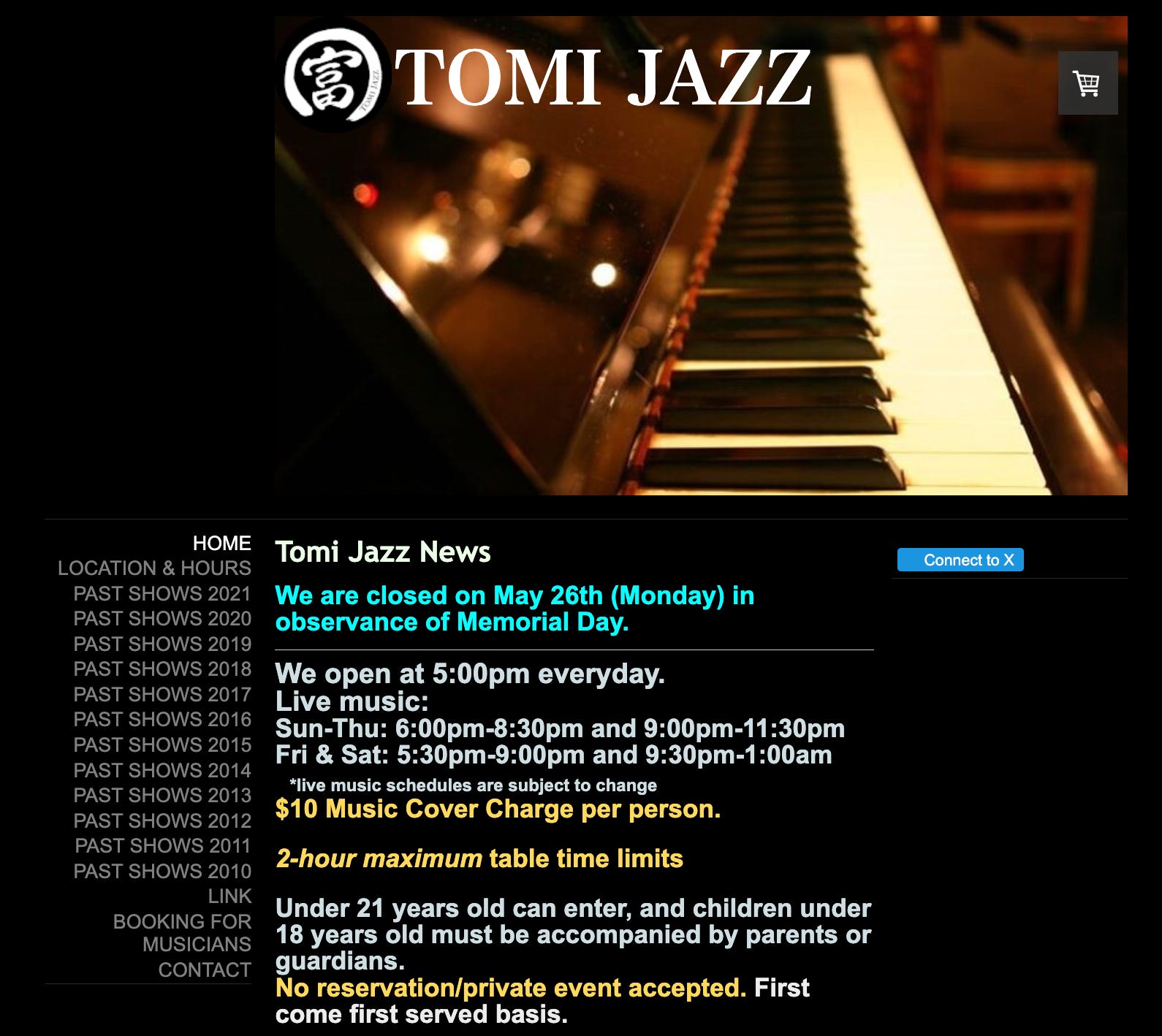
To me, a shitty website for a restaurant is a seal of approval, no different from the 3.5 star rule for Chinese restaurants. Establishments with swanky websites conjure the same skepticism as a nicely-furnished pizza joint, or a laundromat that’s also a café. What’s your angle here?
Bad UX makes a digital experience human
Above all, a friction-full experience is another reminder that someone had to build this with their hands. How were they supposed to know that you prefer one big button instead of several check boxes?
Web versions of mobile-based apps are my favorite example. Watching a TikTok on Safari while ceaselessly fighting off pop-up ads is a humbling experience. The icons are always too small, buttons overlap, swiping up accidentally refreshes your feed. You can’t doom scroll the way you would on your phone. You still get the content, though.
Because there’s little money to be made in web-based social media apps, these experiences have always been half-baked. They mortalize the social media platform, gesturing towards the undergrad interns trying to appease their fresh-grad managers in hopes of a return offer. It’s all just code. Call it kintsugi.
Honorable mentions
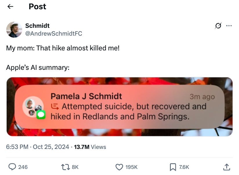
Apple’s AI text summaries
Unchartify, a website that organize Spotify’s song library alphabetically
Substack’s comment button (for the love of god, I’m trying to read the comments)
Bad UX presumes that good UX is the default. But is it really good UX when all it does is generate shareholder value?
To me, bad UX is the glitch in the Matrix, the totem in Inception.
I had a phase where I named every button on my website after a food I liked. Bad idea.
Just wanted to let you know that your writings feel like a fresh air our modern society desperately needed. Like a little yellow Comic Sans in the era of colorless, AI-coded Helvetica. Love it.
"Above all, a friction-full experience is another reminder that someone had to build this with their hands." This feels particularly salient today, when most people don't know modern code. It's so complex now and it's easier to let a professional do it, like how all new cars are basically computers at this point. I remember how to embed html links from computer science in junior high and that's about it.
Most people will use sites like Squarespace or Substack or some other premade template to build a page, so they all end up looking and feeling the same. There are SO many analogs to this, like Pinterest-derived interior design or Instagrammable restaurants. Bad UX feels particularly handmade because it's something someone probably did cobble together themselves.
Thanks so much for the great read. Excited for more of your work and to follow your experiment!